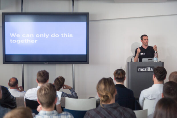
Hi, I’m Marged Cother and I’m Head of Social Media and Digital Engagement here at GDS. Joining me is my partner in crime on this topic, Jo Goodwin, the Head of Social Media at the Office for National Statistics. In this post, we’re going to talk about the accessibility standards we’re putting in place on our social channels, that we’d like other government teams to adopt too.
In the GDS Design principles, we say accessible design is good design. We believe everything we build should be as inclusive, legible and readable as possible. We’ve always tried to ensure the content we create and the way in which we communicate using digital channels follows these same principles, within the restrictions of the channels and resources we have.
We were looking into this and getting advice from Alistair, our Head of Accessibility, when Twitter gladly launched their alt tag capability. And we thought it was the right time to create some shared standards that all government organisations could follow, to cater for the range of people that access government products, services or information through our channels.
Let’s look at the stats and the research
27% of disabled adults in the UK - that’s 3.3 million people - had never used the internet between January and March 2015. In addition, an Office for National Statistics report shows there were 1.1 million lapsed internet users in 2015 and 0.5 million of these users were disabled adults.
Perhaps this demonstrates how difficult a space the internet can be for disabled adults, and it got us thinking: what’s the user need where social media is concerned?
We didn’t want the project to be a paper exercise or allow the guidelines to become a series of tick boxes. We felt it was important to talk to people who use assistive technologies or have additional needs when using the internet so Jo set off to the Digital Accessibility Centre.
All of the user testing team at the Digital Accessibility Centre have a disability and know first-hand whether something is accessible to them. With a wide range of needs, we felt this was a robust user group to talk to and start understand the challenges they face when using social media.
What’s the user need? Over to Jo
During my visit, I was fortunate to have a focus group with 12 of the team and was later given freedom to chat and shadow the team while they worked. It was fascinating to observe.
Below are some profiles of team members I caught up with during my visit and some of the things they told us can make a difference to their experience on social media.
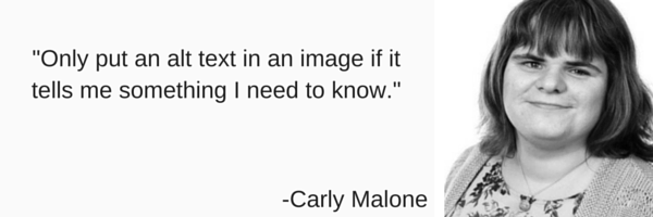
Carly Malone
Carly has been blind since she was 6 years old. She uses screen readers such as Job Access With Speech and NonVisual Desktop Access for browsing the web.
Rebecca Morgan
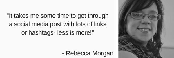
Becs browses the internet using voice activation. She uses voice activation software called Dragon Naturally Speaking. This means Becs can use the computer through voice commands. Becs has a BA (hons) in Education Studies and Social Inclusion, and has recently completed a course in online teaching. Becs is a wheel-chair user with limited mobility in her upper limbs.
Gary Thomas
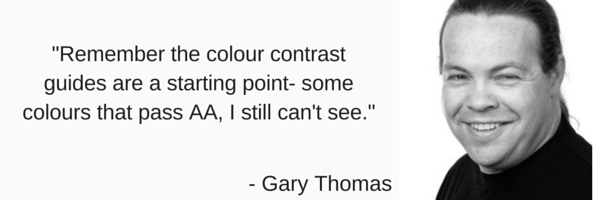
Gary has diabetic retinopathy, which has affected his sight to an extent that he is blind in one eye and has very limited vision in the other. Gary currently uses Zoom-Text screen magnification software.
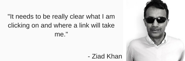
Ziad Khan
Ziad suffered a severe visual impairment in 2009 and quickly sought rehabilitation to enable him to resume work. Ziad learned to touch type and was also trained on Zoom Text.
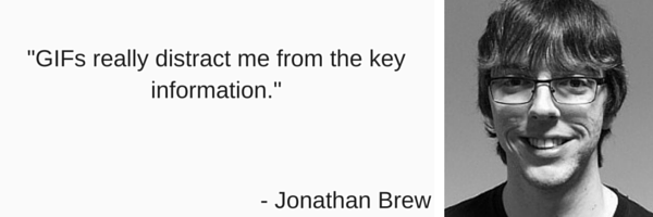
Jonathan Brew
Jonathan has a learning difficulty; he is 20 years old and is interested in all aspects of IT. Jonathan has experience in computer maintenance and upkeep and studied computers in college – First Diploma.
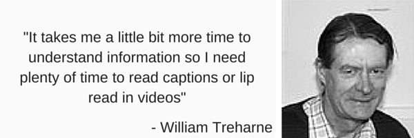
William Treharne
William has autism and is deaf. William has been studying for his level 3 legal executive and passed. He has many other interests including maths, outdoor bowls, climate change, global warming, saving energy and recycling.
It was really insightful and it was also interesting to hear how they find the mobile applications for social media much more user-friendly than desktop versions. This is because the experience on a desktop is hard work, with the additional navigation buttons, more cluttered layout and advertisements.
We also talked about Instagram during our focus group and several people with different needs shared they find hashtags can be frustrating for users that navigate using a keyboard. Each hashtag is seen as a link and so would be an additional tab for the user - so less is more, make those hashtags worthwhile or lose them. One person shared how it can get repetitive and take a long time to get through just one post - and that’s not a great user experience!
More fascinating insight was shared around image-based platforms. I was amazed to find Carlie, who is completely blind, once joined pinterest as she thought it would be interesting content and give her ideas for her personal life. The fact that someone who is blind would like to engage with a visual social media platform surprised me and demonstrated that we should never make assumptions about user behaviour.
We want to thank the accessibility centre for their time and help.
So what are we going to do?
We’ve added accessibility guidelines to the GDS social media playbook to help make social media content more accessible for everyone. We’d like these guidelines to be a minimum standard for government social media, a starting point - something we’d strongly encourage our colleagues to adopt too.
We understand the challenges in that. In an ideal world, we would have resources to be fully inclusive; to have British Sign Language on all video content; for every graphic to be fully optimised; to have live captions on live streaming using tools such as Periscope...but there is still work to do.
And we understand the compromises. Animated GIFs can drive really high engagement in certain messages, and that’s a lot to lose - but we need to use that sparingly, when there are few other ways to getting a message across and certainly ensure there are alternatives available.
But the rewards are so big - and the right thing to do. This is for everyone, and that includes social media too.
We’d love to hear feedback from social media teams: whether you’ve been able to adopt the guidelines or if you have any concerns with accessibility.
If you’d like to chat about social media accessibility or want a bit more information, please don’t hesitate to tweet Jo or Marged.
Follow Marged and Jo on Twitter, and don’t forget to sign up for email alerts.