Everything we write, design or build within government should be accessible for everyone because that’s who our users are. Everyone.
At GDS we have an accessibility community. People working in government can ask for help and advice on how to make a service accessible to everyone, regardless of a disability a user may have or the technology they may use. We have guidance on how to make your service accessible and service and product teams consider accessibility right from the start.
Blog posts should be accessible to everyone too though and we haven’t spoken enough about how we should all be doing this. I’ve pulled out the things that blog owners and admins will need to consider in almost every post they publish.
They definitely don’t make up an exhaustive list, but they’re a start.
Alt text describes an image
Adding images helps increase engagement, particularly on Twitter, so we recommend that each post includes a ‘featured’ image at least. Images should include alt text in the ‘alt text box’ in WordPress to describe what’s happening in the image. This way, if the image won’t load on a user’s device they can read the alt text instead. Alt text will be read aloud by screen readers too so the more detail, the better.
Get the image size right
Lots of users don’t have super-fast internet connections so large images might take a frustrating amount of time to load. Images up to 1000 pixels (px) wide will load easily and be high enough quality so they don’t appear pixelated. When you add an image to a post, choose the ‘large’ option and WordPress will automatically compress it to 620 px wide.
Link to meaningful words
When you link to something, make sure the group of words you link to work as a standalone thing. Users can use screen readers to bring up a list of all the links in a post or page and use it to navigate to something else. If you remove the words around the link, someone should be able to predict the type of content they’re going to get when they select the link.
So these examples work well:
- You can follow GDS on Twitter for updates
- You can read more about it in Giles’ latest post What we mean when we say “show the thing”
Whereas these examples aren’t helpful signposts:
- Click here to follow GDS on Twitter
- Giles wrote about it too
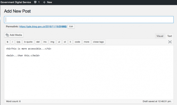
Use the correct HTML for headings
When you’re loading your post into WordPress, load it into the ‘text’ tab rather than the ‘visual’ tab. For each subheading type in:
<h2>your subheading</h2>
Screen readers can pick out words between <h2> and </h2> as being subheadings and the start of a slightly new topic. Using <bold>your subheading</bold> creates something that looks pretty similar, but screen readers can’t flag it as a subheading.
Avoid italics
We mention italics in the GDS style guide and recommend avoiding them because italicised letters can be difficult to read. When you’re talking about a document, scheme or initiative, use single quotation marks.
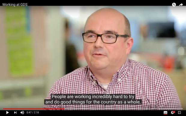
Making videos accessible
If you embed a video with speaking in it, it should include captions to make sure people who are Deaf or hard of hearing aren’t excluded. You should also make sure people have access to the transcript so that someone who doesn’t have the technology to play the video can still access the same information.
Transcripts
Either add a link before the video so the transcript can be downloaded, or add the transcript to the bottom of the post.
Captions
At GDS our videos are hosted on our Youtube channel and when we upload them we copy and paste a transcript into the ‘Transcribe and auto sync’ option. When we select ‘set timings’, Youtube matches the transcript with the spoken words and displays them as captions.
If there’s anything in a video that can only be understood by seeing it (for example instructions to complete something when not everything is spoken), you should provide an audio description for blind and visually impaired users.
Using infographics
Including infographics in a post can be a really helpful way of communicating something you’ve been working on. Often you don’t have the luxury of being able to make the infographic within your team but when you do, you’ve got to keep in mind that people may find it difficult to distinguish colours. Choose them carefully. A colour contrast checker lets you test how accessible 2 colours are together. The ‘contrast ratio’ should be 4.5 : 1 or higher.
You can’t rely on colours to communicate something though - the information also needs to be accessible to people who can’t see the infographic.
If the infographic is fairly simple, add a description of whatever the thing shows to the alt text box. In most cases though, infographics contain loads of, often complex, information. You can pull out the things that are essential to someone’s understanding and describe them in the main body of the post. Bullet point lists are a good way, alternative way to sum up the information conveyed in an infographic. So screen readers can skip over the infographic, the alt text box should have:
alt=” ”
How we’re going to help
Nobody intentionally makes something tricky to access and more often than not, inaccessible posts are down to an honest lack of awareness. As the blog editors at GDS, there’s lots that Claire Sibbick and I could do better to help blog owners and authors consider accessibility. We’re going to:
- send out guidance as part of the new blog owners’ pack when we get a request for a new blog
- recommend giving each blog an accessibility score when we next do an audit of the blogs on GOV.UK to see where we can help improve things
Over to you
If you’re a user and have had accessibility problems with blog posts outside of the things mentioned here, let us know about them in the comments.
Also, if you write or upload blog posts we’re keen to find out if we’ve missed anything that you find you have to consider regularly when you post. We might find there’s a user need for a more comprehensive guide to accessibility in blogging on GOV.UK.
You can follow Amy on Twitter.
1 comment
Comment by Web Axe posted on
Thanks for the post, some great advice! Some feedback:
-Italics (and bolding) is usually not conveyed to a screen reader user so it's not helpful in that case either!
-For infographics, I disagree; I recommend providing a short alternative text such as alt="infographics on making beer" (so a screen reader user knows it's there, and for all the other reasons to use alt). And then provide the long description in addition.
-Captions and Headings are very important and often missed so thanks for including here!
-Large image file sizes is definitely a pain, but more of a usability issue I believe.